Consider the Homeless

Website Redesign
UX Case Study by Valentina Maio

Scope: July 10th - August 6th (4 weeks)

Project Overview

Tools
Figma
Figjam
Zoom
Trello
Google Drive
Canva
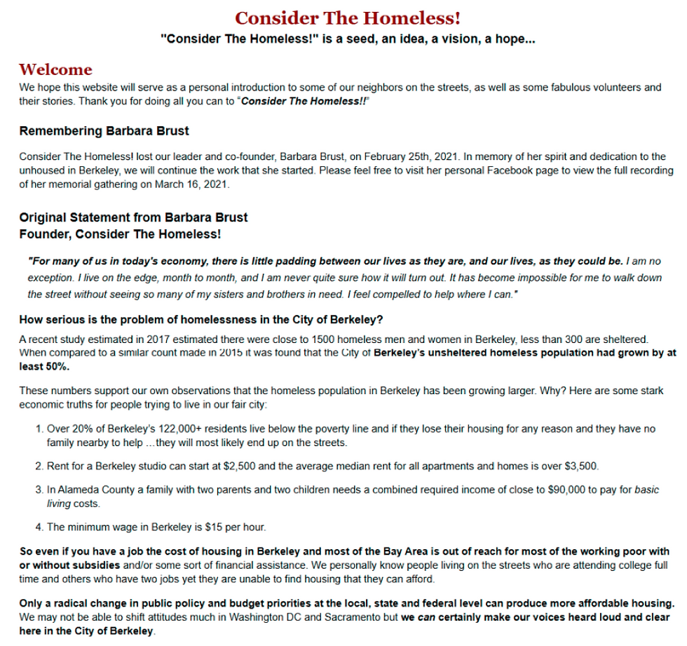
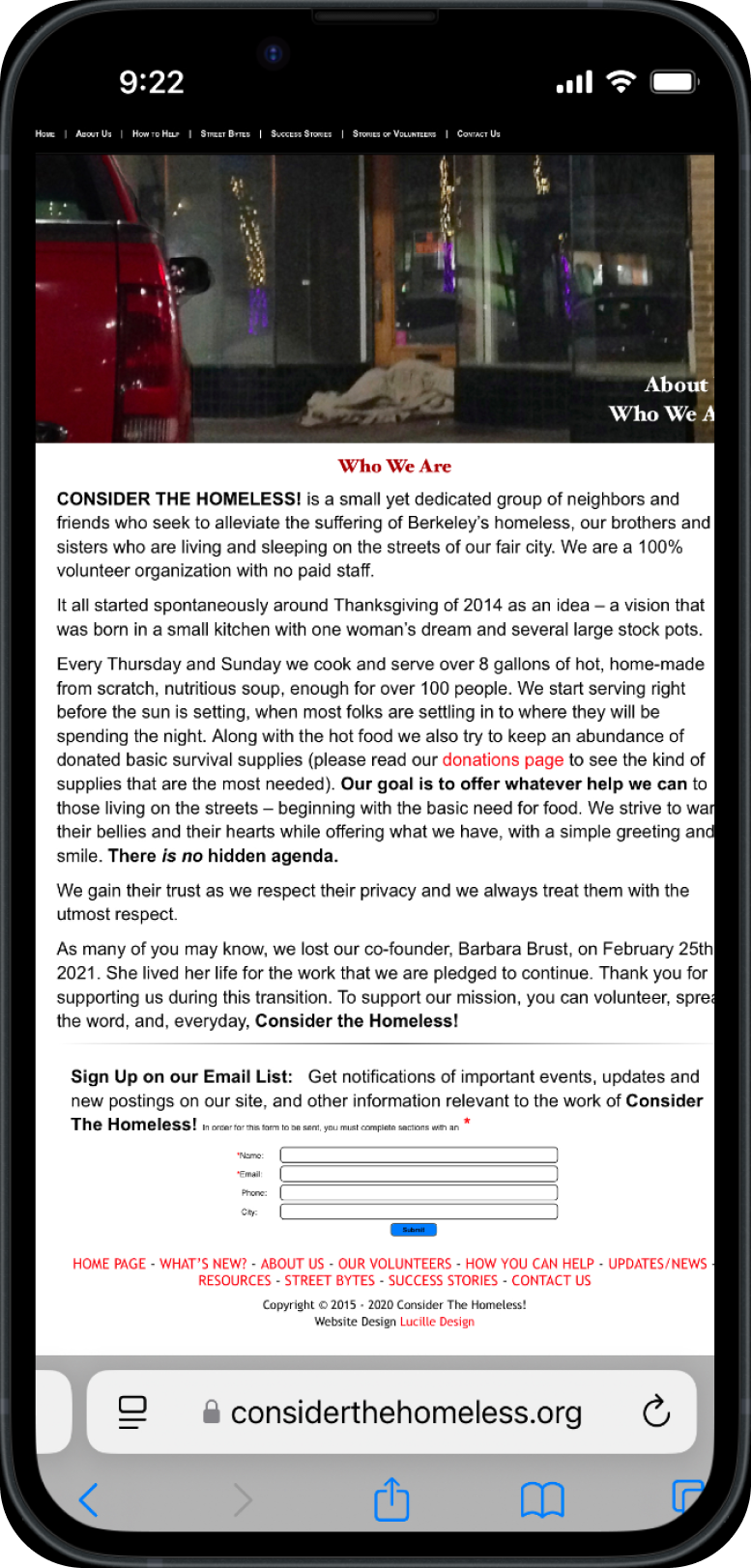
Consider the Homeless, a volunteer-run nonprofit in Berkeley, California, provides nutritious meals to the city’s homeless twice a week. Their website, however, struggled with low traffic and complex volunteer and donation processes. We redesigned the site to be more engaging, intuitive, and visually appealing, simplifying scheduling and donation features to enhance user experience and drive greater engagement with supporters and stakeholders.
Role
Team of 4
UX Researcher
UX Designer
Visual Designer
The Problem
Individuals seeking to sign up for volunteer opportunities on sites like Consider the Homeless often encounter difficult navigation, poor usability, and unappealing imagery, resulting in frustration and decreased user engagement.
My Impact
Research: Led user interviews and helped develop and analyze a survey to guide the project.
Prototyping: Led the design and iterations of mobile and desktop prototypes in Figma after the team created wireframes.
Testing: Created a user testing script, planned the testing schedule, and conducted all user tests.
Project Management: Managed team progress through Trello and Google Drive, ensuring timely delivery of all deliverables.
Design Process
Project Timeline
Week 1
Week 2
Week 3
Week 4
Test
Feedback
Iteration
Future Enhancements
Design
Wireframe
Hi-Fi
Design
Prototype
Our design process focused on creating a digital experience that increased site traffic, boosted engagement, and encouraged more volunteer sign-ups, resulting in a streamlined, independent online presence for Consider the Homeless.
User Persona
Empathy Map
User Journey
Research
User Research
User Interview
Competitive Analysis
Define
User Flow
Card Sorting
Information Architecture
Ideate
Pain Points and Opportunties
1. Information Architecture

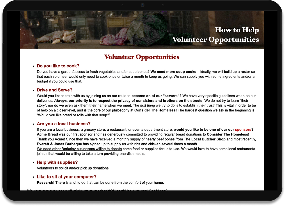
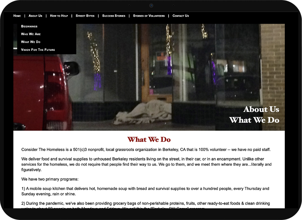
Users faced challenges with confusing navigation, broken links, and unclear descriptions. Improving the information architecture was prioritized to build trust and clarity.
2. Visual Design
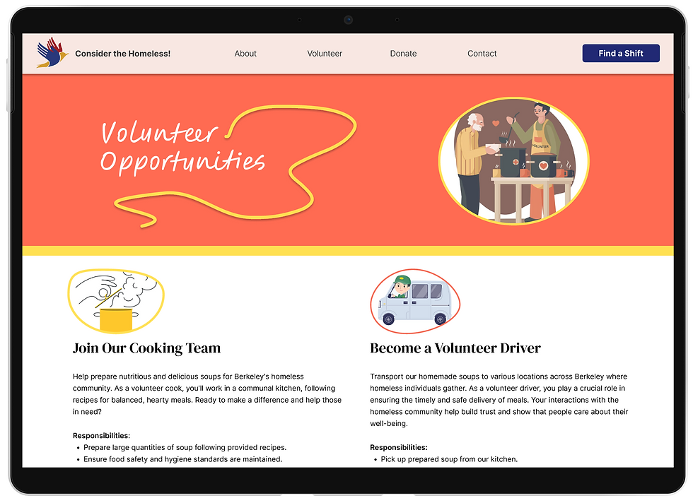
The original design used dull imagery and basic colors. We refreshed the visual identity with a new color palette, fonts, and graphics to better reflect Consider the Homeless’s dedication to Berkeley’s homeless community.

3. Usability
The website lacked essential features like shift sign-ups and availability. By adding a streamlined, visually engaging Volunteer sign-up page, we significantly improved user experience and engagement.
Competitive Analysis

Performing a competitive analysis on both indirect and direct competitors established a path for what features were commonly found in different volunteer websites.
UI Heuristics Analysis
To gain a clearer understanding of why the current website was falling short of its engagement goals and to identify ways to enhance the user interface, our team conducted a thorough analysis of the existing webpages. Here’s what we discovered:
The primary goal of the website is to getting volunteers to help sign up
The existing navigation is disorganized, redundant, and unclear
Broken links are scattered throughout the website, giving it a flawed appearance and leading to confusion for users
The current website is dull and lacks engaging visuals and interesting features
User Research
Interviews with 8 participants and surveys of 35 showed that users value convenience and trust. They’re more likely to volunteer when sign-ups and scheduling are easy, and they return when the site features clear usability, quality imagery, and testimonials from past volunteers.
Observations
75%
of users preferred to sign up directly on the website
User Insights
Users would like to know the actual impact of volunteering they do
Users would like to get involved with volunteering but are unsure of where to start
Users would be more motivated to volunteer if the process was more organized and transparent
Users wish they had easier access to key information about organizations
50%
of users sited that they needed to know about the organization
37.5%
say that they are highly motivated by trustworthiness and convenience
User Persona
Helen, based in Berkeley, is seeking volunteer opportunities that align with her desire for fulfillment and community engagement. She’s looking for a nonprofit to volunteer with on weekends, ideally one that combines her love of cooking and passion for giving back.

55 years old
Biologist
college educated
wants to volunteer
Goals/Needs
wants to make an impact
wants to join a community
find an organization she can volunteer at
wants to feel inspired
Helen Smith
User Journey Map
Task
Learn about CTH
Engage the user enough to explore volunteer positions
Navigate menu
Browse volunteer shifts and donation pages
Select a shift that works with schedule
Finish sign-up
Create a profile
Confirm volunteer shift
Feeling
Thoughts
Website design is engaging and friendly
imagery feels trustworthy
clear difference of volunteer roles I can choose
I can see availability
fast and easy sign up process
feels trustworthy and popular
excited to be involved in the community and volunteer easily
Opportunities
incorporate statistics and volunteer testimonials
increase # of Find a Shift buttons to make sign up quick and seamless
select a shift before full onboarding process
track volunteer shifts and award for participation
Site Map

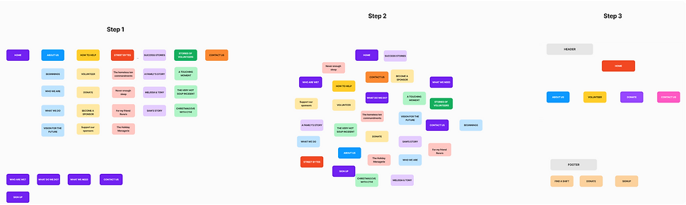
We identified inefficiencies in the navigation—overcrowded tabs, redundant information, and excessive clicks—that frustrated users.

By removing duplicate pages, consolidating tabs, and streamlining the sign-up flow, we made it faster and easier for users to find what they need and complete tasks.
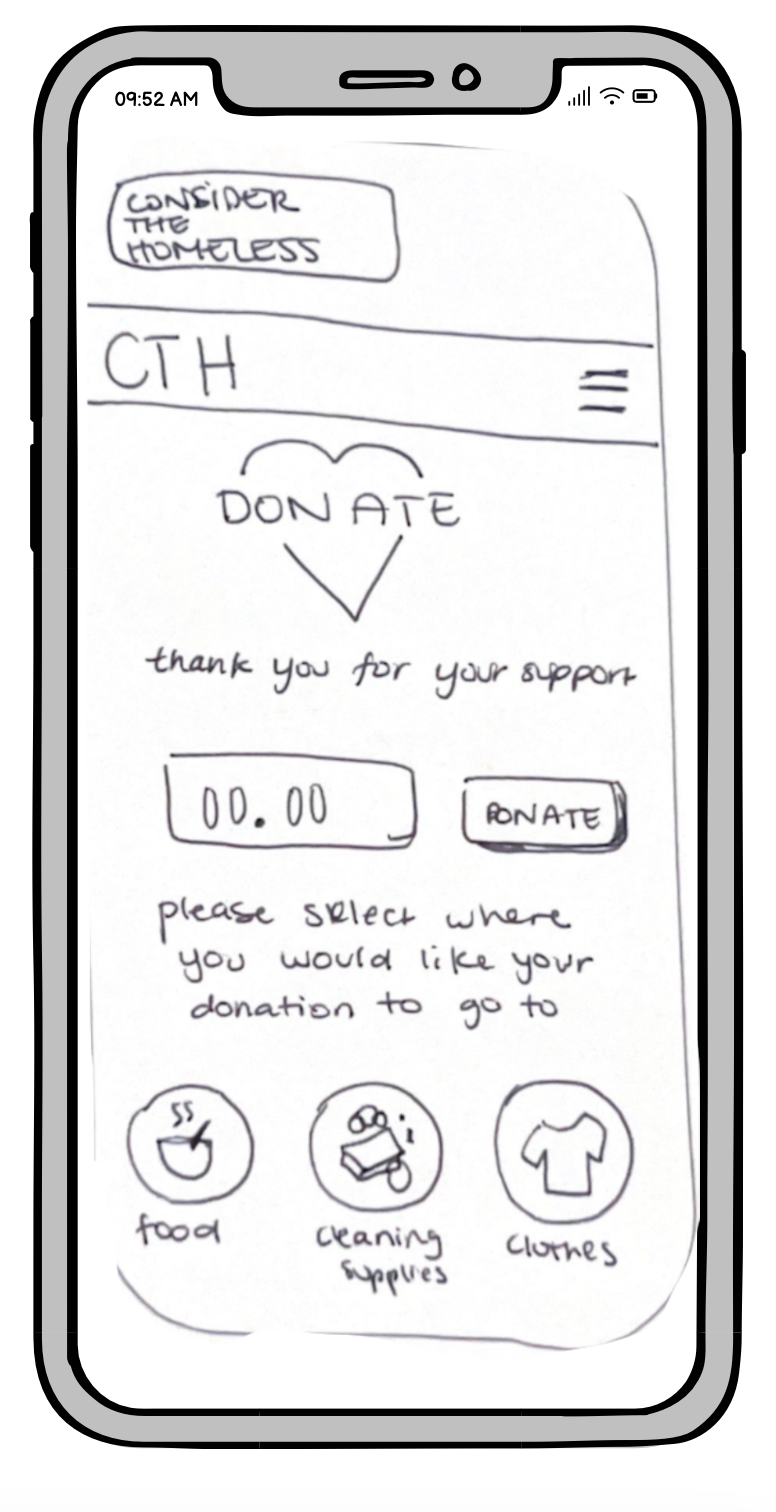
Paper Prototypes
Beginning the ideation stage with paper prototypes allowed us to envision and map out the information architecture, user path and features of the digital volunteering experience for Consider the Homeless.


Iterations
Revamped Visual Identity
Enhanced readability and visuals
Optimized navigation flow
Revamped color palette and fonts


Iterations


Improved Volunteer Sign-up
Reorganized volunteer information
Concise and simple language
Streamlined onboarding process
Iterations

Refined Information Architecture
simplified information structure
reorganized order of About, Volunteer and Donation pages
Calendar visual improves organization and visuals


Style Guide
The redesign overhauled the style guide with a new color palette, fonts, and graphic elements, strengthening Consider the Homeless’s visual identity and reinforcing its commitment to Berkeley’s homeless community.

A/B Testing
Our team tested multiple volunteer shift and sign up layouts in hifi A/B testing asking users if they preferred picking a shift versus signing up to volunteer first. Our results revealed that users wanted to select a shift first before signing up.


Outcomes
Increased brand trust
Clearer understanding of the organization's mission
Streamlined sign-up process
Easy access to available shifts
High Fidelity Prototype
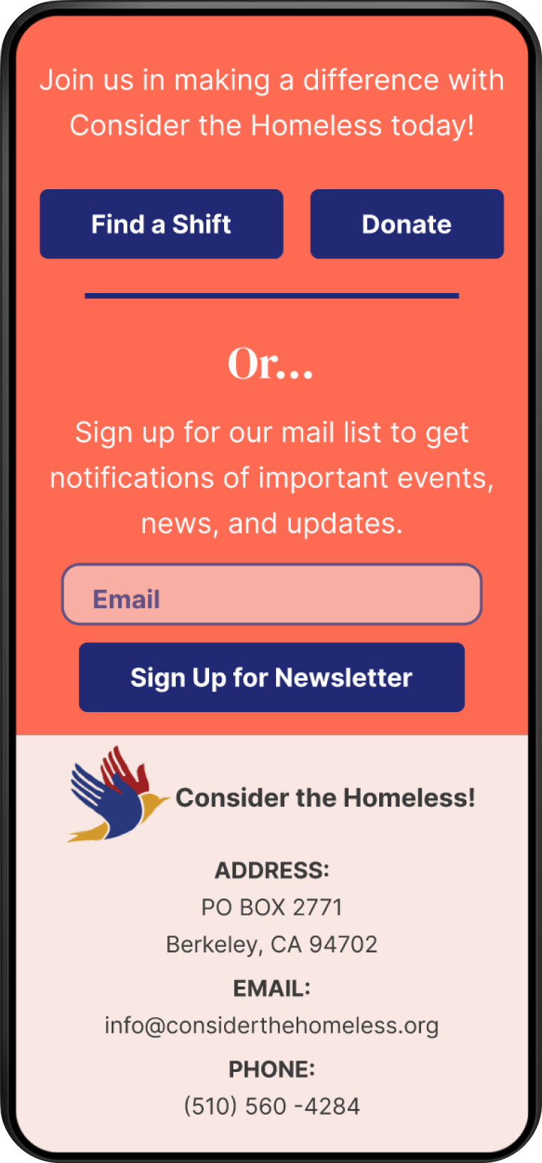


Increased number of “Find a Shift” and “Donate” buttons to enhance user engagement
Revamped color palette, imagery, testimonials to maintain CTH ethos while elevating brand image
Added statistic visuals to showcase volunteer impact
Included icons to distinguish available volunteer shifts to allow users to quickly find and select a shift


High Fidelity Prototype

Future Development
Allow volunteers to track their hours and reward for milestones
Provide status of shifts
Launch promotional volunteer events especially around the holidays
Key Takeaways
Identifying user problems early keeps the project on track and within scope
User testing is essential to developing effective iterations
It's critical to keep the focus on the problem you're solving and the user you're solving it for
